
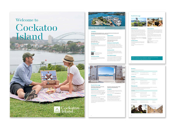
CLIENT: Sydney Harbour Federation Trust
Updating the Accommodation Compendium with a fresh new look and images.
COMPANY: SYDNEY HARBOUR FEDERATION TRUST
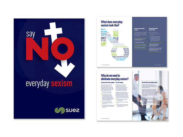
CLIENT: SUEZ ANZ
This was one of a series of internal brochures I worked on with the HR team and the senior designer. The hard part about this brochure was to choose images that were not offensive and indirectly told a story rather than taking the more cliche route with such a sensitive subject.
COMPANY: SUEZ ANZ
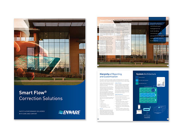
CLIENT: Enware
For this job I worked with product managers and R&D managers to create a brochure for a new product aimed at the corrections sector. This brochure was to be used at an annual event and needed to show how the system worked in simple terms so anyone who attended the show could understand the process.
COMPANY: ENWARE
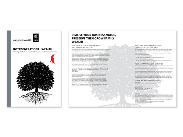
CLIENT: NAB Private Wealth
I designed the look and feel for a new product targeting family businesses and the challenges they face when exiting their businesses. It needed to have a connection to the NAB Private Wealth brand, but be less high level than most of the NAB Private Wealth collateral.
COMPANY: CREATE DESIGN & MARKETING / NV DESIGN
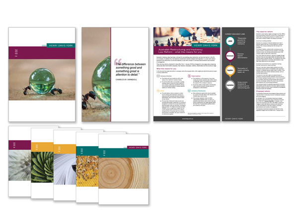
CLIENT: Henry Davis York (HDY)
At the beginning of 2017 I undertook a brand refresh of the HDY collateral. It included image choice, colours and redesign of the layout of our templates, presentations and brochures.
COMPANY: HDY

CLIENT: Export Finance and Insurance Corporation (EFIC)
After collaborating with a strategic agency on look and feel for our rebrand, I took the designs inhouse and pushed the designs into various formats including a folder for the sales team.
COMPANY: EFIC
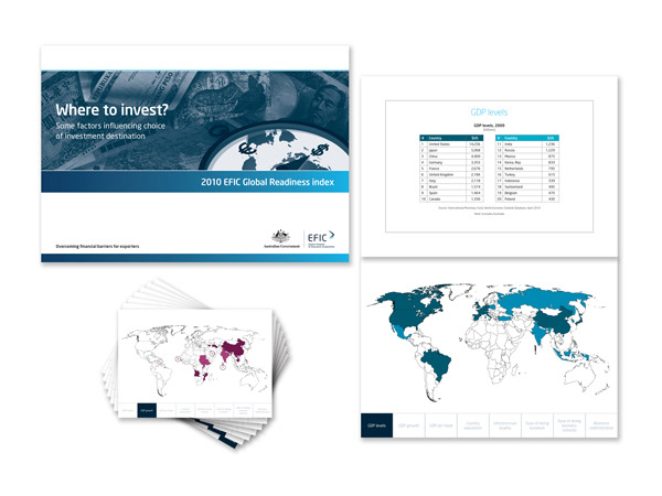
CLIENT: Export Finance and Insurance Corporation (EFIC)
Working with marketing and economics teams to create an informative and fun takeaway for an event, I researched ways to create the flip book that was not only in budget but could be produced on time and with up-to-date information.
COMPANY: EFIC

CLIENT: No Time to Lose
The brief was to create a 4 page brochure to promote a new service by the printer called cold foil printing. I chose the images and fonts and then designed each page with supplied text.
COMPANY: CREATE DESIGN & MARKETING / NV DESIGN
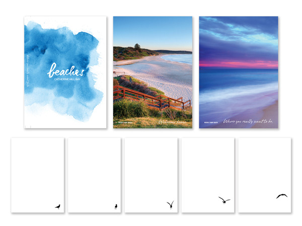
CLIENT: The Rose Group
This was a promotional note book for a new property development. The first few pages was to promote the stunning local area, then the following pages was to be a flip-book promoting the lifestyle. So after looking at ideas of sailing and surfing, I came up with the idea of a flying seagull that takes off and lands throughout the remaining pages.
COMPANY: CREATE DESIGN & MARKETING / NV DESIGN
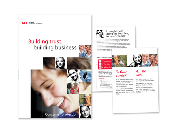
CLIENT: Westpac
Working with the creative director and style guide, we created an easy to read internal document about consumer protection for Westpac staff.
COMPANY: RICHARD KNIGHT DESIGN