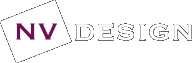
CLIENT: Henry Davis York (HDY)
At the beginning of 2017 I undertook a brand refresh of the HDY website. It included image choice, colours and redesign of the website layout. This look and feel was then used for their other templates and brochures.
COMPANY: HDY
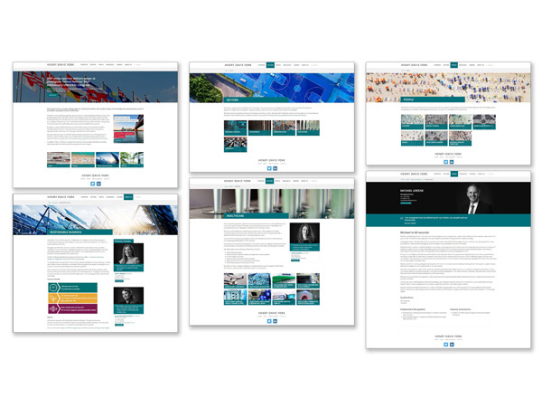
CLIENT: Export Finance and Insurance Corporation (EFIC)
In the 2009 rebrand I collaborated with our strategic agency on all things including the logo. And when our MD asked how we could get our Aboriginal heritage onto our new logo, I created the double boomerang image that speaks of our heritage, returning profits to Australia and working with our clients to help them succeed.
COMPANY: EFIC
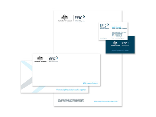
CLIENT: Export Finance and Insurance Corporation (EFIC)
Working with the needs of the organisation, I created frosting for offices and meeting rooms, plus changeable wall art for the office renovations.
COMPANY: EFIC
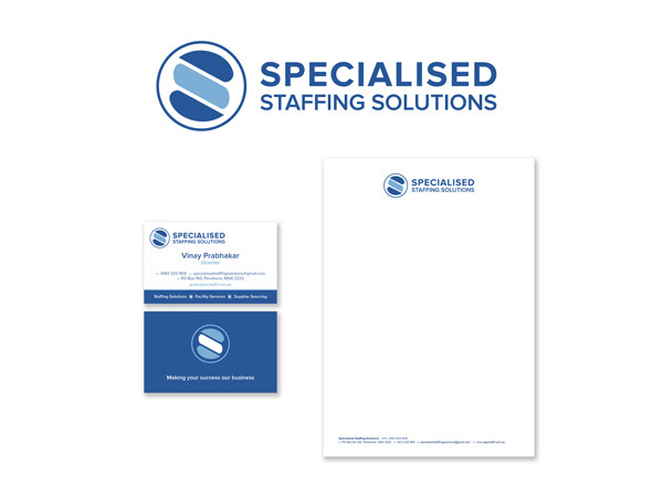
CLIENT: Specialised Staffing Solutions
This client wanted an identity that was able to talk to his corporate clients, highlighted the idea of being specialised, but also allowed for company to grow its offering. So the concept behindthe icon was the three tiers of service they offered, plus an 'S' shape for specialised and service. And from above it could also be thought of as his staff serving their customers.
COMPANY: NV DESIGN
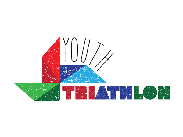
CLIENT: Youth Triathlon
This client was looking for a logo for the first annual kid’s triathlon. It needed to incorporate a pinwheel, which is a symbol for child abuse prevention in the Louisiana area. They also wanted something playful and young to suit the audience. This design incorporates a touch of fun with the grungy/scratchy design and font choice, plus the word youth is "running" over the side of the hill. The pinwheel is a reminder of the cause and represents the 3 parts to a triathlon.
COMPANY: NV DESIGN
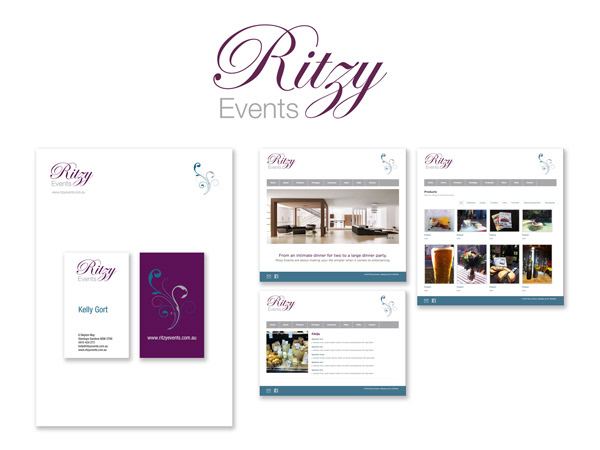
CLIENT: Ritzy Events
This client wanted an identity that was both feminine and modern with a classic look for their new events business. So I created two elements for them. First the logo using just their name that combined both classic and modern fonts. Second an icon that could be used on all their materials as a stand-alone icon. I then created business cards, letterhead, plus a mock-up for their website.
COMPANY: NV DESIGN